Hilarious Examples Of Bad Designs …Number 4 Is Brilliant
1.Are these burgers healthy, or do they have to be healed? Either way I would not give this leaflet the go ahead if it was my restaurant.

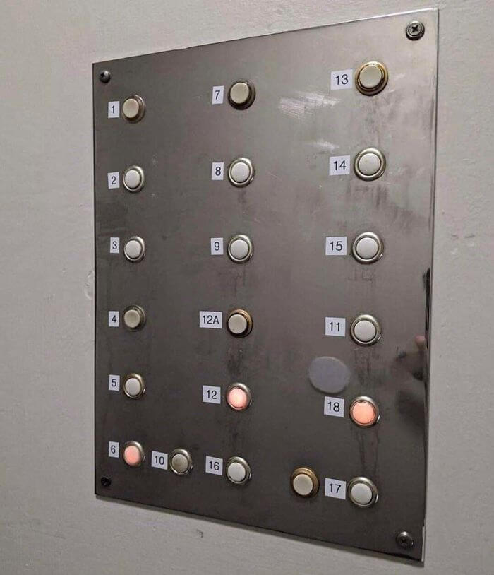
2.This elevator button system takes a bit of getting used to. I’d be riding up and down all day trying to get to the right level after pressing all the wrong buttons.

3.Imagine spending hundreds or even thousands of dollars to a design company only for them to do this. What makes it so funny, is it talks about trust, and it makes it look like they are not in line with their values… which is literally the opposite of what they are trying to promote.

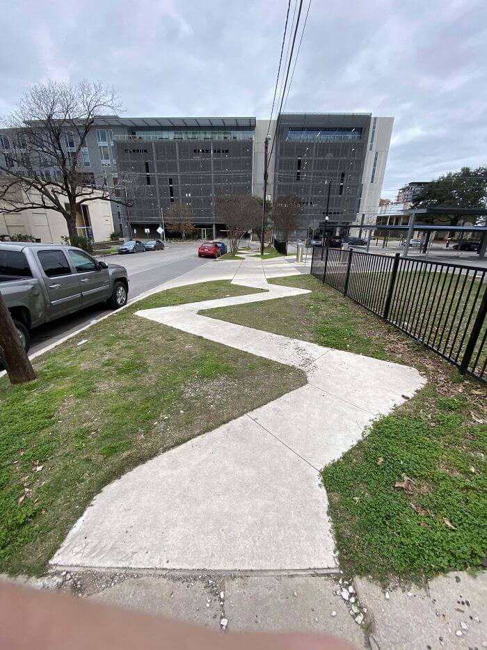
4.Just looking at this pathway is making me feel drunk, let alone trying to walk on it.

5. Obviously the wording is questionable, but the fact they chose a picture of a child that looks uncomfortable as a sign to entice customers in is just very bad design.

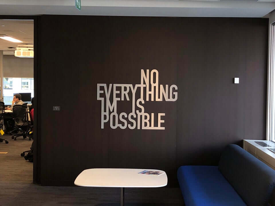
6.We love to see awkward signs, and this one positioned in an office to inspire the workers leaves most people baffled by how its meant to be read.

You’ve just read, Hilarious Examples Of Bad Designs. Office Signs Why not read Manager Had To Hire A New Employee.

