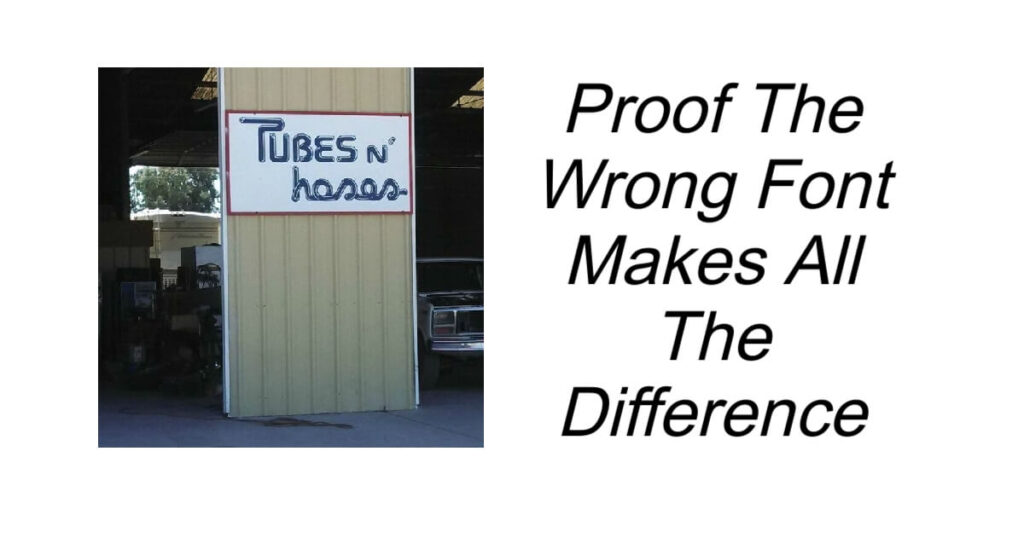
Proof The Wrong Font Makes All The Difference
We have posted before about how Bad Letter Spacing Makes All The Difference so today we are sharing with you hilarious examples of how font design can ruin (or make hilarious) even the best thought-out text.
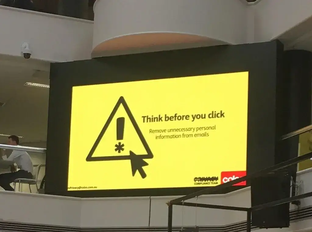
1.Think before you click… and next time think before you choose a font. Whoever signed off on this announcement board needs firing.
2.I really hope this is a font error, and this restaurant doesn’t serve hair with their food.

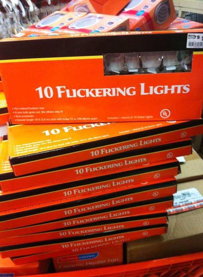
3.Nothing brings more to that festive feeling than flickering lights.
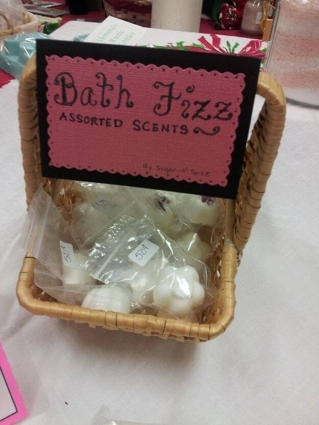
4.Calm down, calm down! These are just bath fizz… not what your dirty mind is thinking.
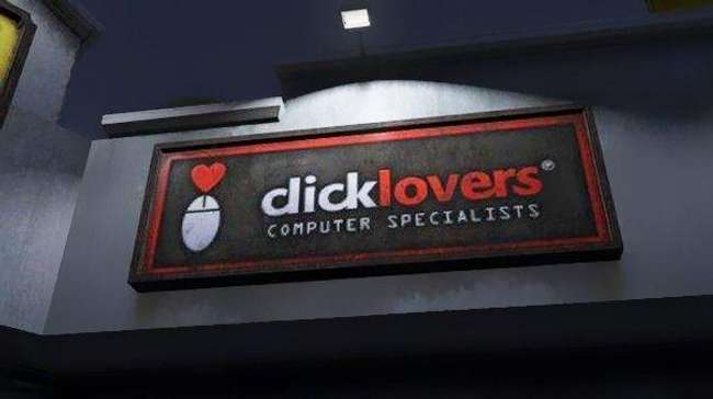
5. Another font error involving the word ‘click’ you’d think these computer specialists would know more about fonts than anyone else.
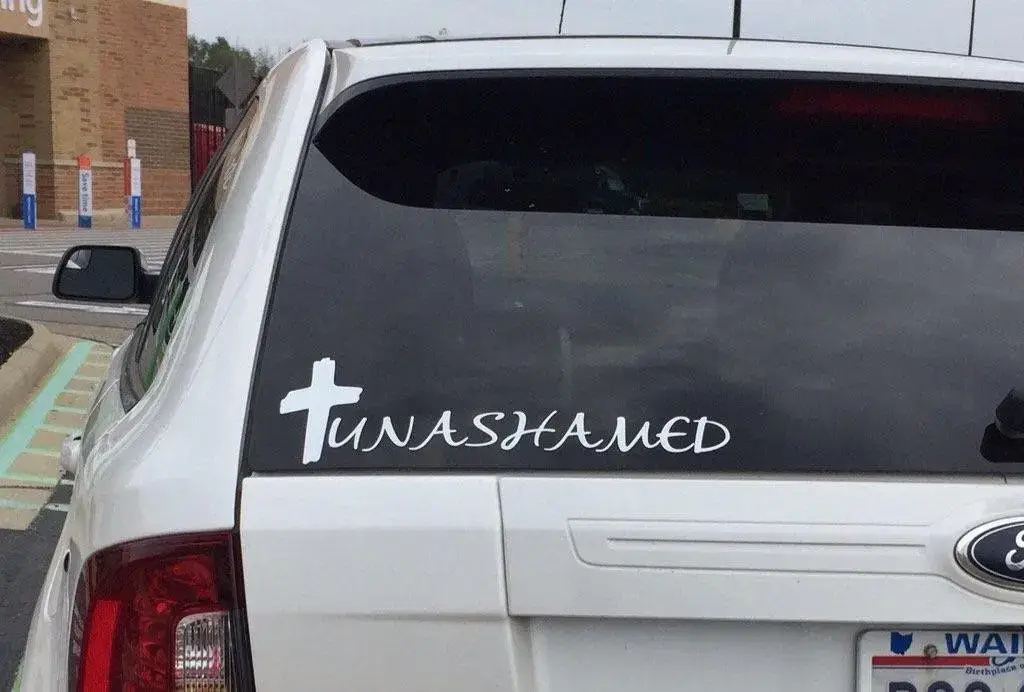
6.They should be ashamed about the font they chose and the way the cross looks like a T making it look like tuna shamed.
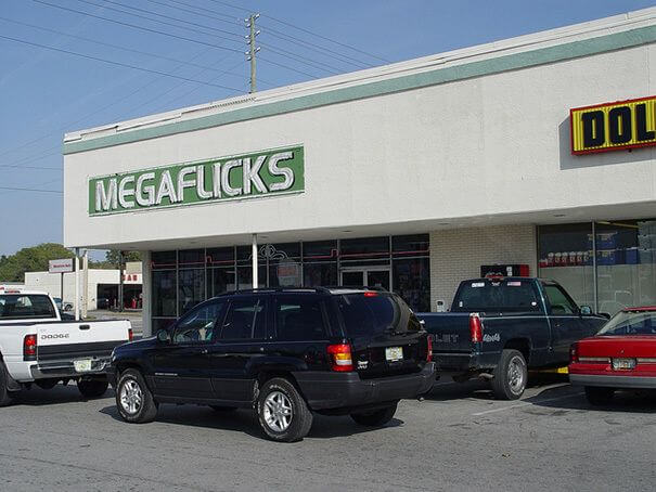
7. WTF, what are they selling here? MEGA-what? You’d have thought with being a successful business they’d have the money to design a sign that reads properly.
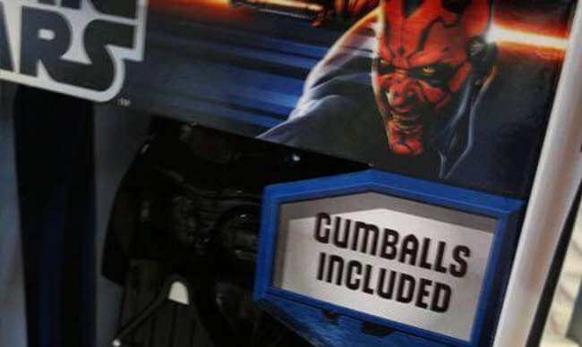
8.They are including what now? I have really been put off the GUM Balls
You’ve just read, Proof The Wrong Font Makes All The Difference. Why not read Manager Had To Hire A New Employee.

